I went through a google image search of "expressionist painting", and without thinking too much, picked out all the paintings from the first few pages that stuck out to me as being interesting. This was the result:

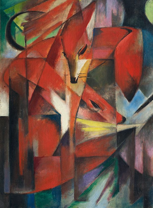
It's interesting that there are some obvious themes coming through in what i choose. A lot of the paintings use only a few main colours, and then have some lighter colours as accents. (forgive my lack of painting terminology, perhaps i should research that...)
I'm not suprised that i picked a lot of two/three colour images, because this was an aesthetic i started developing for my own brand in last year in one of my papers (identity and the internet).
I think looking at these has helped me in thinking how I could push this colours further in my design. I am really really liking the red/blue/white mixture that is apparent in a few of the paintings. I assume its the same painter that did three or four with the same colour scheme and style.
Oh and here's a list of the links:
http://www.artyfactory.com/art_appreciation/animals_in_art/franz_marc/foxes.jpg


